Red Deer
Branding
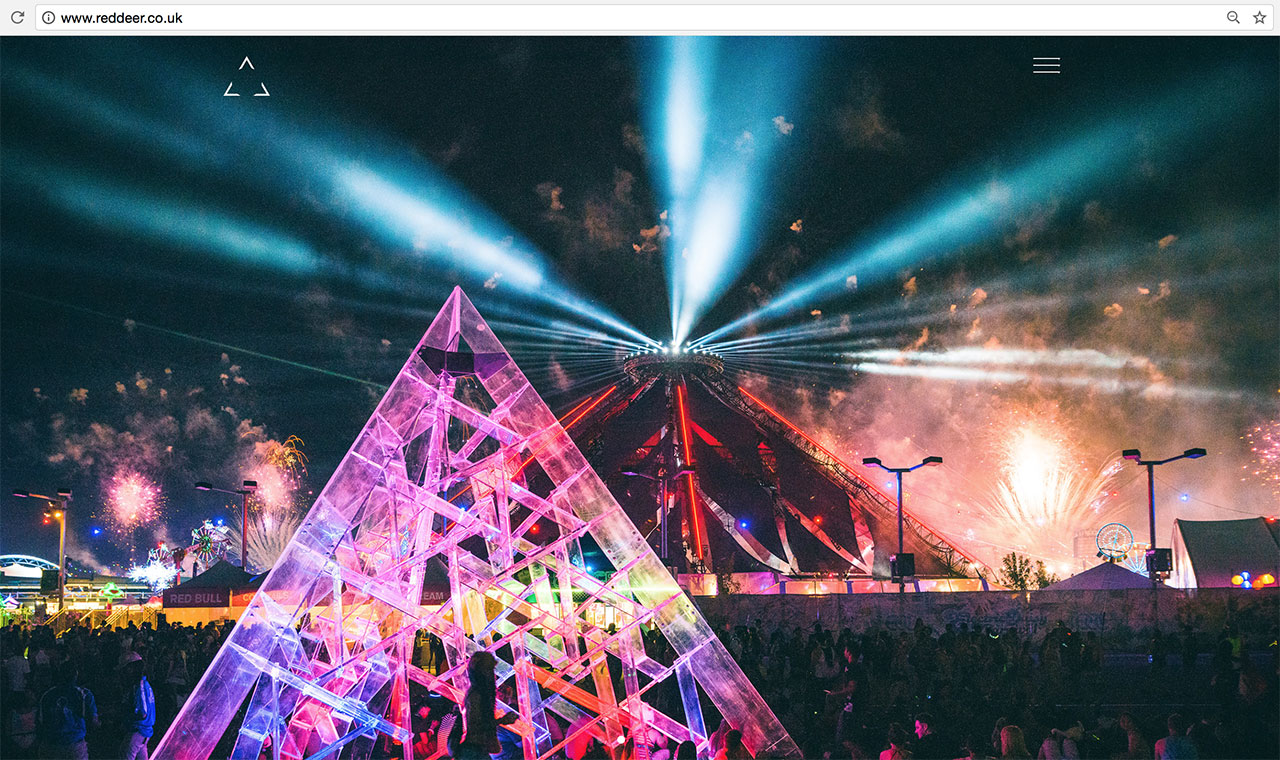
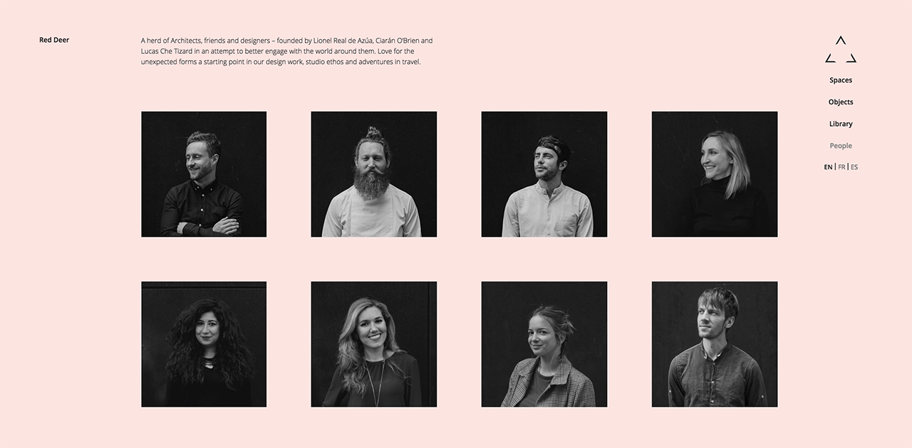
Inspired by their structure - 3 enigmatic architects, designers & friends pivoting around their magical commercial director - and one of their milestone project - "Luz", a glass pyramid - the red deer logo is designed as pure architecture.
Open space, shapes, angles, softness, emotion, sharpness, silence, playfulness, minimalism & impact.
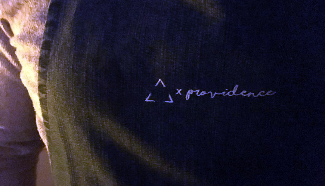
It's a joy to witness the logo being alive though all their assets, throughout the years, with a special mention to the branded apron used in their dinner networking nights - in aid of their charity 'providence' giving out dinners to the most left out communities in London. What a special team.